Chapter 5 Plotly
5.1 Plotly简介
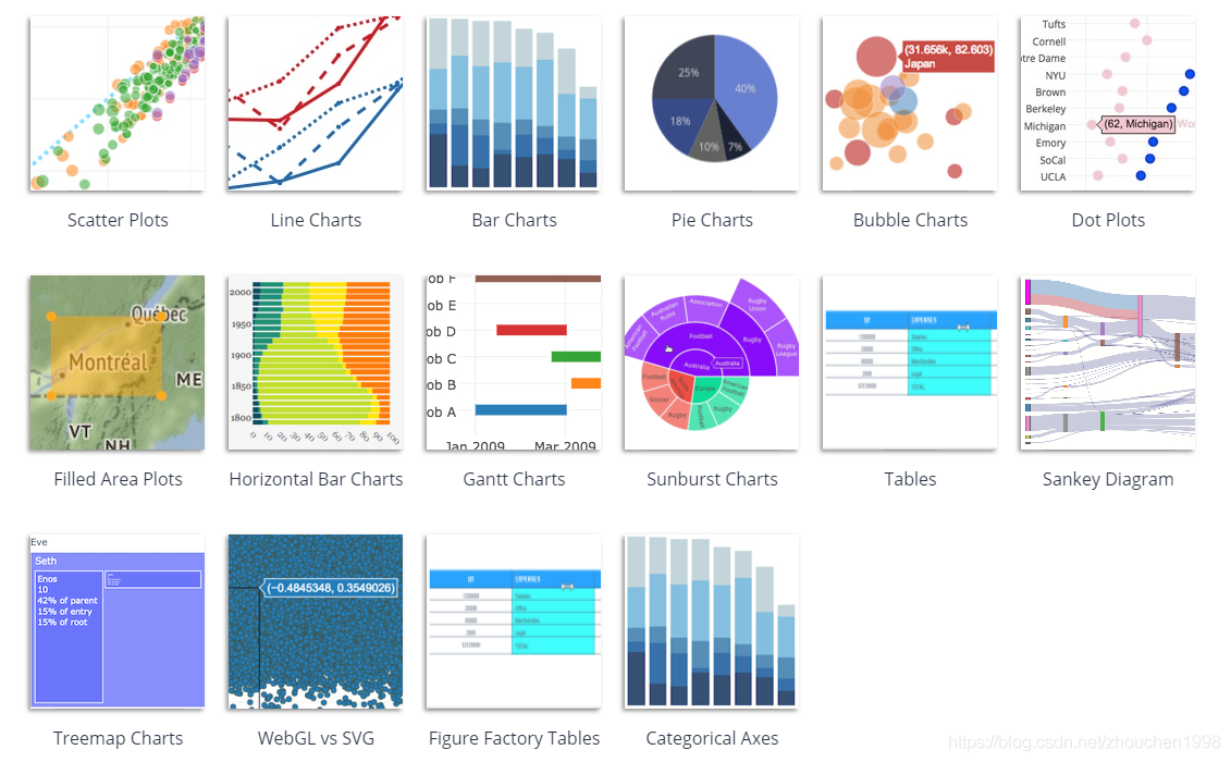
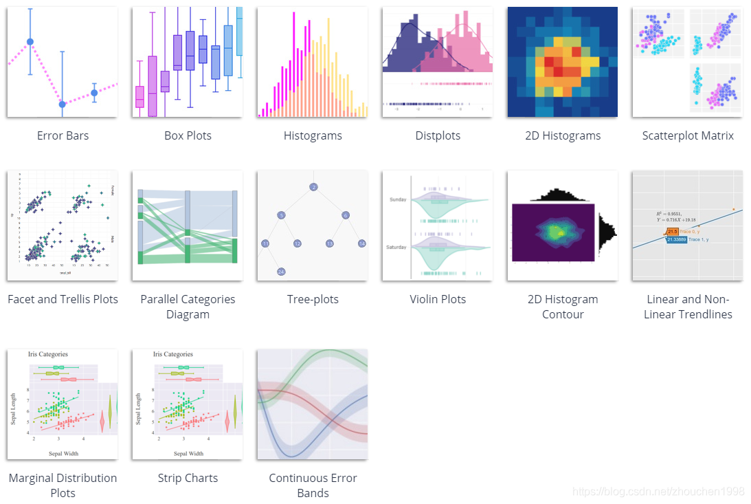
Plotly是一个非常强大的开源交互式可视化框架,它通过构建基于 HTML 的交互式图表来显示信息,可创建各种形式的精美图表。Plotly提供了Python,R,Matlab等多种语言API,因此我们可以很方便地在这些软件中调用Plotly,从而快速实现交互式的可视化绘图。
5.2 Plotly工作流
使用plotly-R包制作的图形是由JavaScript库plotly.js提供底层支持。plotly-R包中的核心函数是plot_ly(),它连接了R与js。我们首先来尝试使用plot_ly()探索ggplot2中的diamonds数据集,了解如何使用plotly工作。
5.2.1 构建plotly对象
# load packages
library(plotly)
library(dplyr)
library(htmlwidgets)
library(htmltools)
# load the diamonds dataset from the ggplot2 package
data(diamonds, package = "ggplot2")
diamonds## # A tibble: 53,940 × 10
## carat cut color clarity depth table price x y z
## <dbl> <ord> <ord> <ord> <dbl> <dbl> <int> <dbl> <dbl> <dbl>
## 1 0.23 Ideal E SI2 61.5 55 326 3.95 3.98 2.43
## 2 0.21 Premium E SI1 59.8 61 326 3.89 3.84 2.31
## 3 0.23 Good E VS1 56.9 65 327 4.05 4.07 2.31
## 4 0.29 Premium I VS2 62.4 58 334 4.2 4.23 2.63
## 5 0.31 Good J SI2 63.3 58 335 4.34 4.35 2.75
## 6 0.24 Very Good J VVS2 62.8 57 336 3.94 3.96 2.48
## 7 0.24 Very Good I VVS1 62.3 57 336 3.95 3.98 2.47
## 8 0.26 Very Good H SI1 61.9 55 337 4.07 4.11 2.53
## 9 0.22 Fair E VS2 65.1 61 337 3.87 3.78 2.49
## 10 0.23 Very Good H VS1 59.4 61 338 4 4.05 2.39
## # … with 53,930 more rowsplot_ly(diamonds, x = ~cut)plot_ly(diamonds, x = ~cut, y = ~clarity)plot_ly(diamonds, x = ~cut, color = ~clarity, colors = "Accent")5.2.2 添加trace
p <- diamonds %>%
plot_ly(x = ~cut) %>%
add_histogram(name = "hist") %>%
group_by(cut) %>%
summarise(n = n()) %>%
add_text(
text = ~scales::comma(n), y = ~n,
textposition = "top middle",
cliponaxis = FALSE,
name = "text"
) %>%
ungroup() %>%
mutate(avg = mean(n)) %>%
add_lines(y = ~avg,
opacity = 0.8,
line =list(width=2),
name = "avg"
)
p5.2.3 获取源数据
p %>% plotly_data()## # A tibble: 5 × 3
## cut n avg
## <ord> <int> <dbl>
## 1 Fair 1610 10788
## 2 Good 4906 10788
## 3 Very Good 12082 10788
## 4 Premium 13791 10788
## 5 Ideal 21551 107885.2.4 发布可视化作品
saveWidget(p, "p.html", selfcontained = F, libdir = "lib")5.3 Plotly基础
正如我们在第2节中所看到的,一个plotly图像由多条trace组成,每种trace对应一个画图类型,例如,点、线、文本和多边形,与R base plot 和 ggplot2类似。这些trace通过add_trace()或add_*()函数(add_markers(), add_lines(), add_paths(), add_segments(), add_ribbons(), add_area(), and add_polygons()等)来创建。
5.3.1 markers
# load the mpg dataset from the ggplot2 package
data(mpg, package = "ggplot2")
mpg## # A tibble: 234 × 11
## manufacturer model displ year cyl trans drv cty hwy fl class
## <chr> <chr> <dbl> <int> <int> <chr> <chr> <int> <int> <chr> <chr>
## 1 audi a4 1.8 1999 4 auto… f 18 29 p comp…
## 2 audi a4 1.8 1999 4 manu… f 21 29 p comp…
## 3 audi a4 2 2008 4 manu… f 20 31 p comp…
## 4 audi a4 2 2008 4 auto… f 21 30 p comp…
## 5 audi a4 2.8 1999 6 auto… f 16 26 p comp…
## 6 audi a4 2.8 1999 6 manu… f 18 26 p comp…
## 7 audi a4 3.1 2008 6 auto… f 18 27 p comp…
## 8 audi a4 quattro 1.8 1999 4 manu… 4 18 26 p comp…
## 9 audi a4 quattro 1.8 1999 4 auto… 4 16 25 p comp…
## 10 audi a4 quattro 2 2008 4 manu… 4 20 28 p comp…
## # … with 224 more rows5.3.1.1 Alpha
plot_ly(mpg, x = ~cty, y = ~hwy) %>%
add_markers(alpha = 0.3)5.3.1.2 Colors
discrete
plot_ly(mpg, x = ~cty, y = ~hwy) %>%
add_markers(color = ~factor(cyl))continuous
plot_ly(mpg, x = ~cty, y = ~hwy) %>%
add_markers(color = ~cyl) %>%
colorbar()no mapping data values
plot_ly(mpg, x = ~cty, y = ~hwy) %>%
add_markers(color = I("black"))5.3.1.3 Symbols
plot_ly(mpg, x = ~cty, y = ~hwy) %>%
add_markers(symbol = ~factor(cyl))5.3.1.4 Size
plot_ly(mpg, x = ~cty, y = ~hwy, alpha = 0.3) %>%
add_markers(size = ~cyl)5.3.2 Lines
# load the txhousing dataset from the ggplot2 package
data(txhousing, package = "ggplot2")
txhousing## # A tibble: 8,602 × 9
## city year month sales volume median listings inventory date
## <chr> <int> <int> <dbl> <dbl> <dbl> <dbl> <dbl> <dbl>
## 1 Abilene 2000 1 72 5380000 71400 701 6.3 2000
## 2 Abilene 2000 2 98 6505000 58700 746 6.6 2000.
## 3 Abilene 2000 3 130 9285000 58100 784 6.8 2000.
## 4 Abilene 2000 4 98 9730000 68600 785 6.9 2000.
## 5 Abilene 2000 5 141 10590000 67300 794 6.8 2000.
## 6 Abilene 2000 6 156 13910000 66900 780 6.6 2000.
## 7 Abilene 2000 7 152 12635000 73500 742 6.2 2000.
## 8 Abilene 2000 8 131 10710000 75000 765 6.4 2001.
## 9 Abilene 2000 9 104 7615000 64500 771 6.5 2001.
## 10 Abilene 2000 10 101 7040000 59300 764 6.6 2001.
## # … with 8,592 more rows5.3.2.1 Linetypes
top5 <- txhousing %>%
group_by(city) %>%
summarise(avg = mean(sales, na.rm = TRUE)) %>%
arrange(desc(avg)) %>%
top_n(5)
tx5 <- semi_join(txhousing, top5, by = "city")
plot_ly(tx5, x = ~date, y = ~median) %>%
add_lines(linetype = ~city)5.3.3 Bars & histograms
p1 <- plot_ly(diamonds, x = ~price) %>%
add_histogram()
p2 <- plot_ly(diamonds, x = ~cut) %>%
add_histogram()
subplot(p1, p2) %>% hide_legend()Multiple numeric distributions
one_plot <- function(d) {
plot_ly(d, x = ~price) %>%
add_histogram() %>%
add_annotations(
~unique(clarity), x = 0.5, y = 1,
xref = "paper", yref = "paper", showarrow = FALSE
)
}
diamonds %>%
split(.$clarity) %>%
lapply(one_plot) %>%
subplot(nrows = 2, shareX = TRUE, titleX = FALSE) %>%
hide_legend()Multiple discrete distributions
plot_ly(diamonds, x = ~cut, color = ~clarity) %>%
add_histogram()percent
# number of diamonds by cut and clarity (n)
cc <- count(diamonds, cut, clarity)
# number of diamonds by cut (nn)
cc2 <- left_join(cc, count(cc, cut, wt = n, name = 'nn'))
cc2 %>%
mutate(prop = n / nn) %>%
plot_ly(x = ~cut, y = ~prop, color = ~clarity) %>%
add_bars() %>%
layout(barmode = "stack")5.3.4 Boxplots
p <- plot_ly(diamonds, y = ~price, color = I("black"),
alpha = 0.1, boxpoints = "suspectedoutliers")
p1 <- p %>% add_boxplot(x = "Overall")
p2 <- p %>% add_boxplot(x = ~cut)
subplot(
p1, p2, shareY = TRUE,
widths = c(0.2, 0.8), margin = 0
) %>% hide_legend()d <- diamonds %>%
mutate(cc = interaction(clarity, cut))
# interaction levels sorted by median price
lvls <- d %>%
group_by(cc) %>%
summarise(m = median(price)) %>%
arrange(m) %>%
pull(cc)
plot_ly(d, x = ~price, y = ~factor(cc, lvls)) %>%
add_boxplot(color = ~clarity) %>%
layout(yaxis = list(title = ""))5.4 Plotly进阶
5.4.1 ggplotly
data("iris")
one_ggplot <- function(i = 1){
themr <- ggthemr(palette[i], set_theme = FALSE)
p <- iris %>%
ggplot(aes(Sepal.Length, fill = Species)) +
geom_histogram(binwidth = 0.2) +
get_ggthemr_color(palette = palette[i], return_type = "fill") +
themr$theme
return(p)
}
one_ggplot()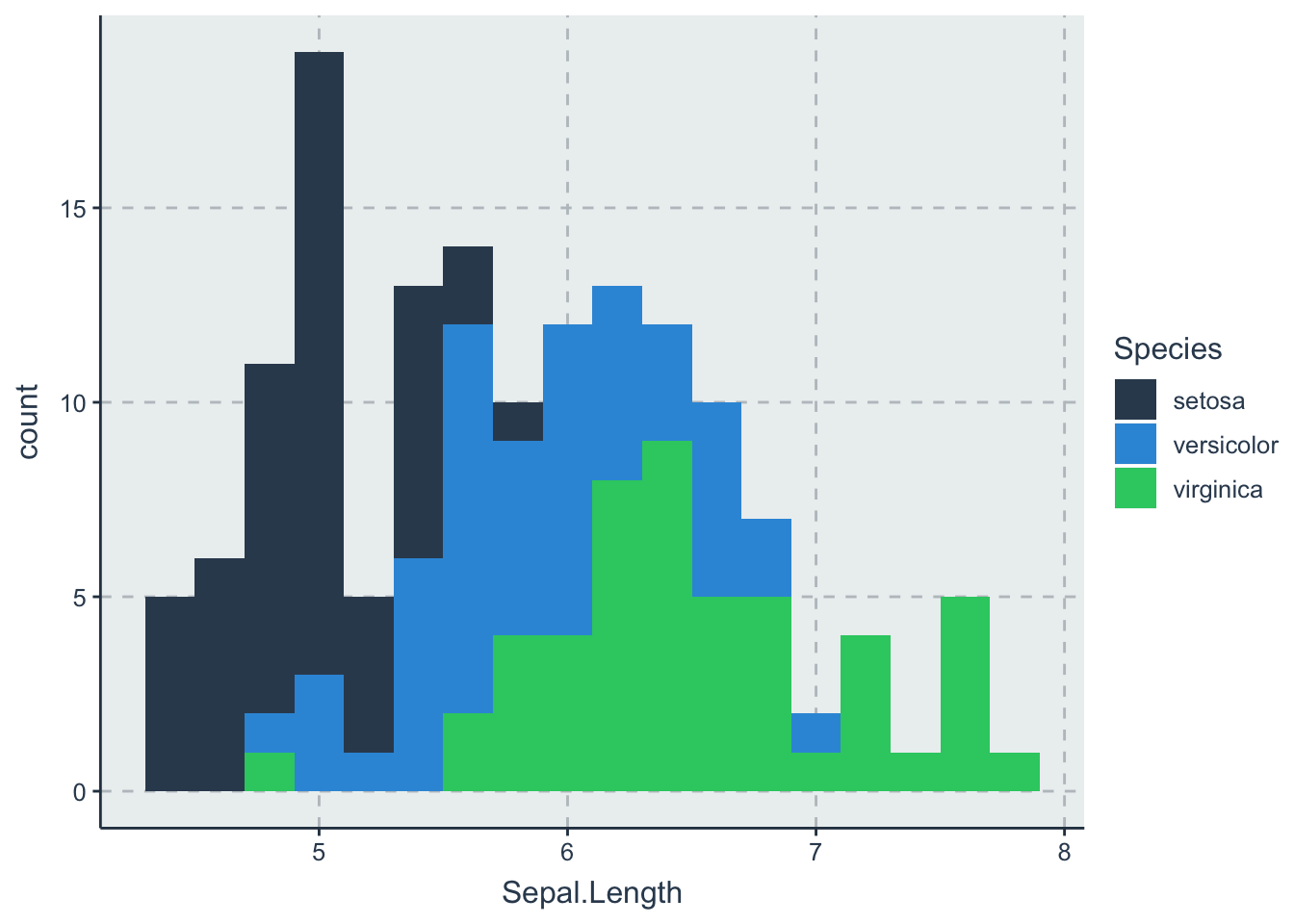
one_ggplot() %>%
ggplotly()5.4.2 layout
title_font <- list(color = "white", size = 26, family = "Microsoft YaHei")
axis_font <- list(color = "white", size = 20, family = "Microsoft YaHei")
plot_ly(mpg, x = ~cty, y = ~hwy) %>%
add_markers(color = ~factor(cyl)) %>%
layout(
title = list(
text = paste('markers-dark-theme'),
font = title_font
),
showlegend = TRUE,
legend = list(font = list(color = 'white')),
yaxis = list(
tickmode='array',
autorange = TRUE,
showgrid = FALSE,
title = list(text = 'cty') ,
showline = TRUE,
color = 'white',
font = axis_font,
nticks = 4
),
xaxis = list(
showline = TRUE,
title = list(text = 'hwy'),
color = 'white',
font = axis_font
),
paper_bgcolor = "#000000",
plot_bgcolor = "#000000",
margin = list(
t = 90,
b = 90,
l = 90,
r = 90
)
)5.4.3 Javascript
plotly_hover, plotly_click, plotly_selected
example 1
p <- plot_ly(mtcars, x = ~wt, y = ~mpg) %>%
add_markers(
text = rownames(mtcars),
customdata = paste0("https://www.bing.com/search?q=", rownames(mtcars))
)
onRender(
p, "
function(el) {
el.on('plotly_click', function(d) {
var url = d.points[0].customdata;
window.open(url);
});
}
")Click 👆
example 2
nms <- names(mtcars)
p <- plot_ly(colors = "RdBu") %>%
add_heatmap(
x = nms,
y = nms,
z = ~round(cor(mtcars), 3)
) %>%
onRender("
function(el) {
Plotly.d3.json('mtcars.json', function(mtcars) {
el.on('plotly_click', function(d) {
var x = d.points[0].x;
var y = d.points[0].y;
var trace = {
x: mtcars[x],
y: mtcars[y],
mode: 'markers'
};
Plotly.newPlot('filtered-plot', [trace]);
});
});
}
")
# In a temporary directory, save the mtcars dataset as json and
# the html to an test.html file, then open via a web server
withr::with_path(tempdir(), {
jsonlite::write_json(as.list(mtcars), "mtcars.json")
html <- tagList(p, tags$div(id = 'filtered-plot'))
save_html(html, "mtcars.html")
# if (interactive()) servr::httd()
})Click 👇